Brand Identity
Cedar Haus - Airbnb & Real Estate
Brand identity for a hospitality and short-term rental brand. Warm, architectural visual language for a property management company.
Client
Concept project
Year
2023
Services
The Brief
Cedar Haus is a short-term rental and real estate brand operating in the Airbnb market. The founders needed a brand identity that would feel premium, trustworthy, and warm - standing out from the typically cold corporate aesthetic of property management.
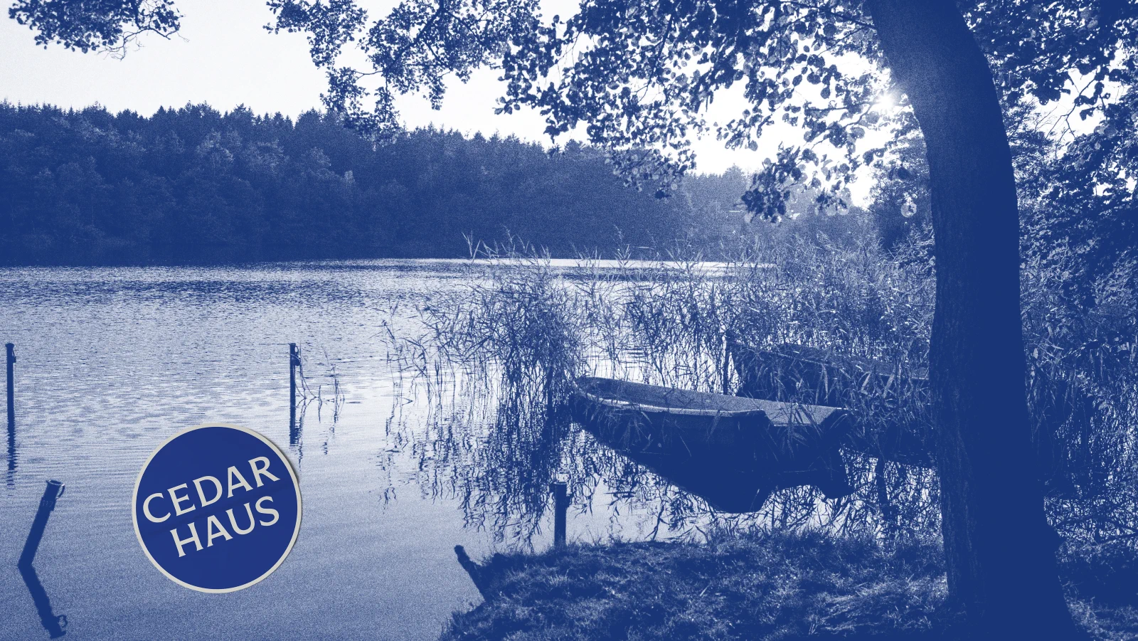
The goal was to create a visual system that works equally well on a property listing thumbnail, a welcome book inside the apartment, and a business card handed to a property owner. Every touchpoint needed to reinforce the same message: this is a company that cares about the details.
The Approach
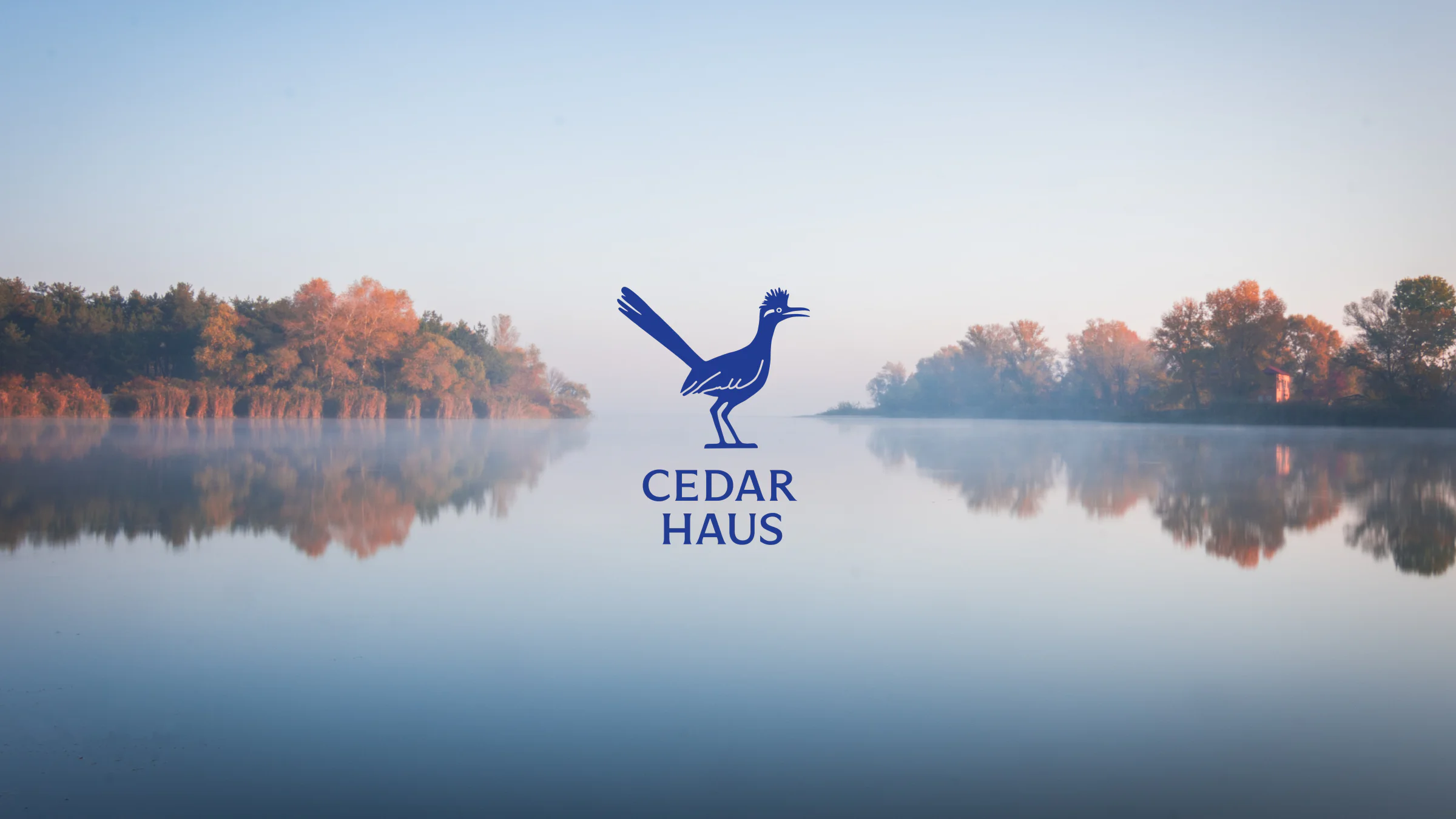
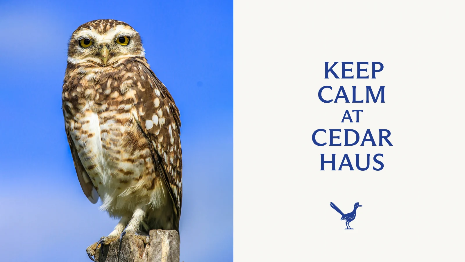
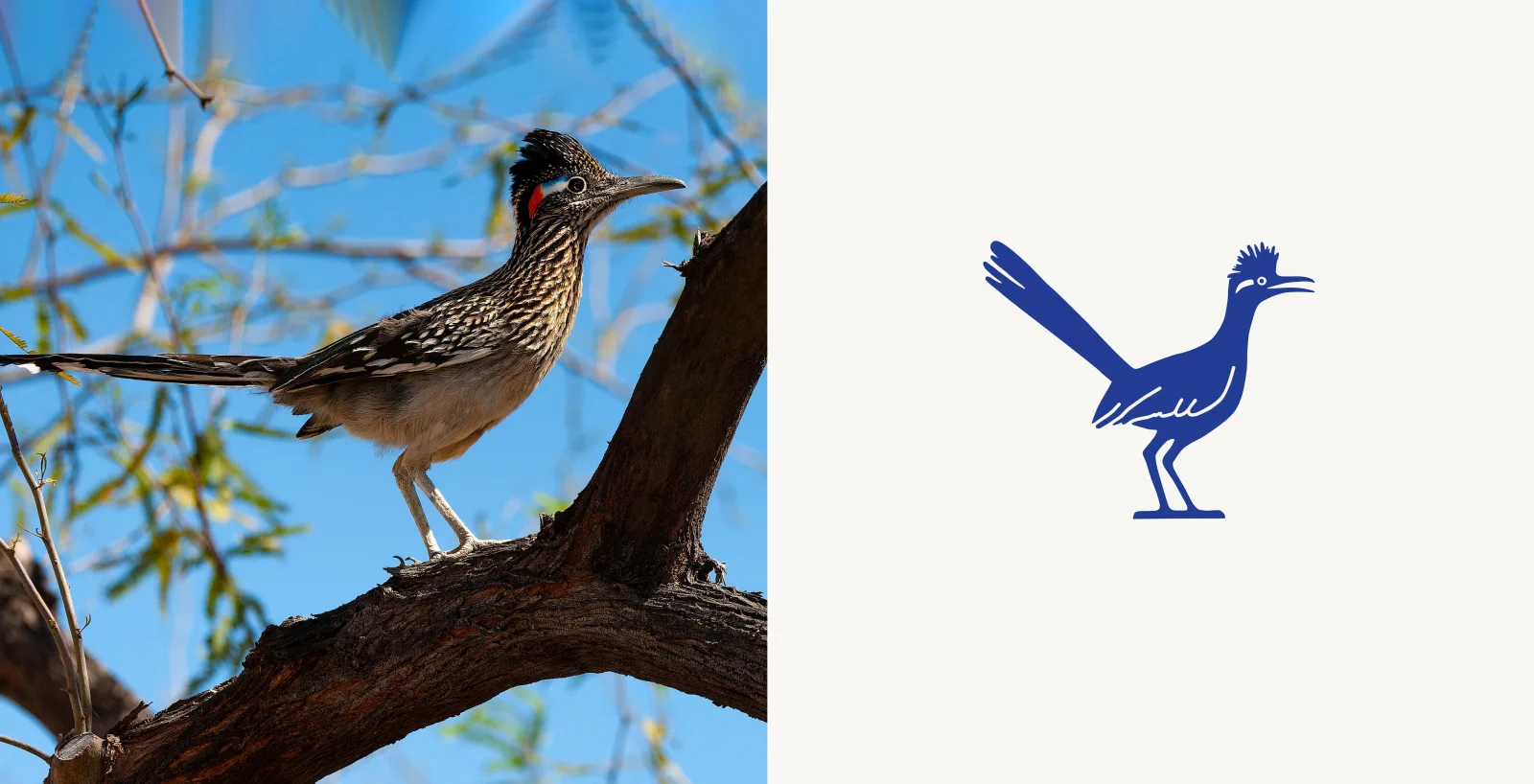
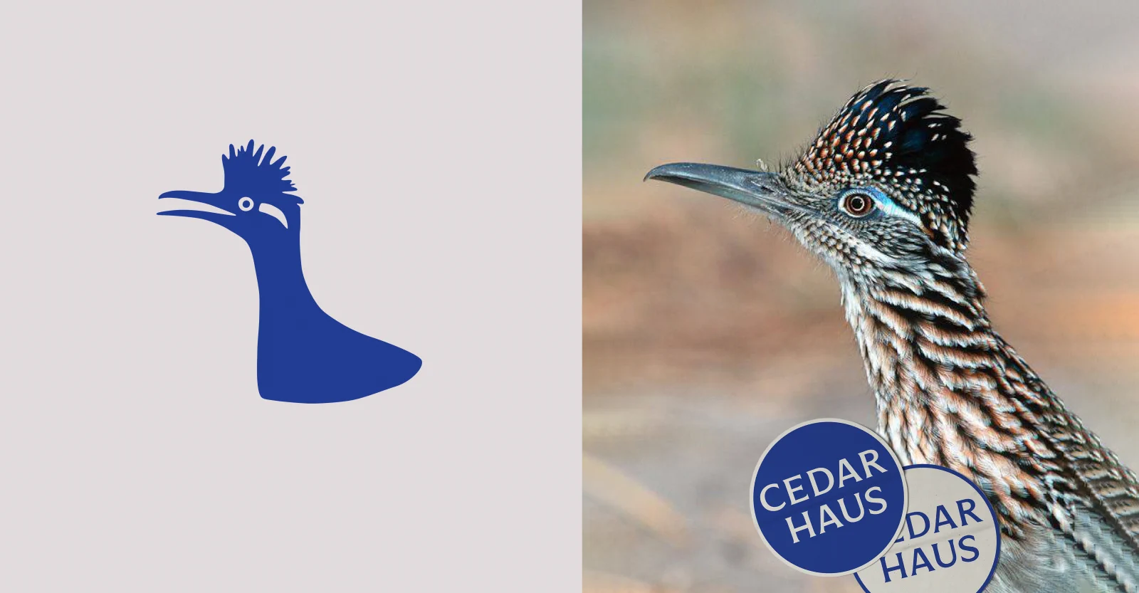
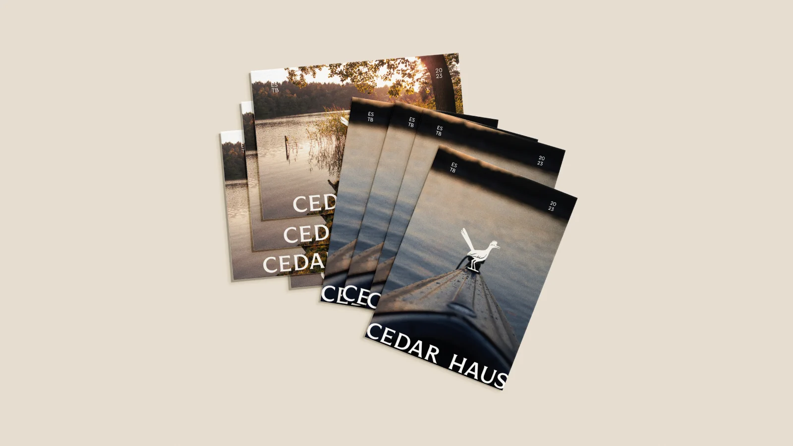
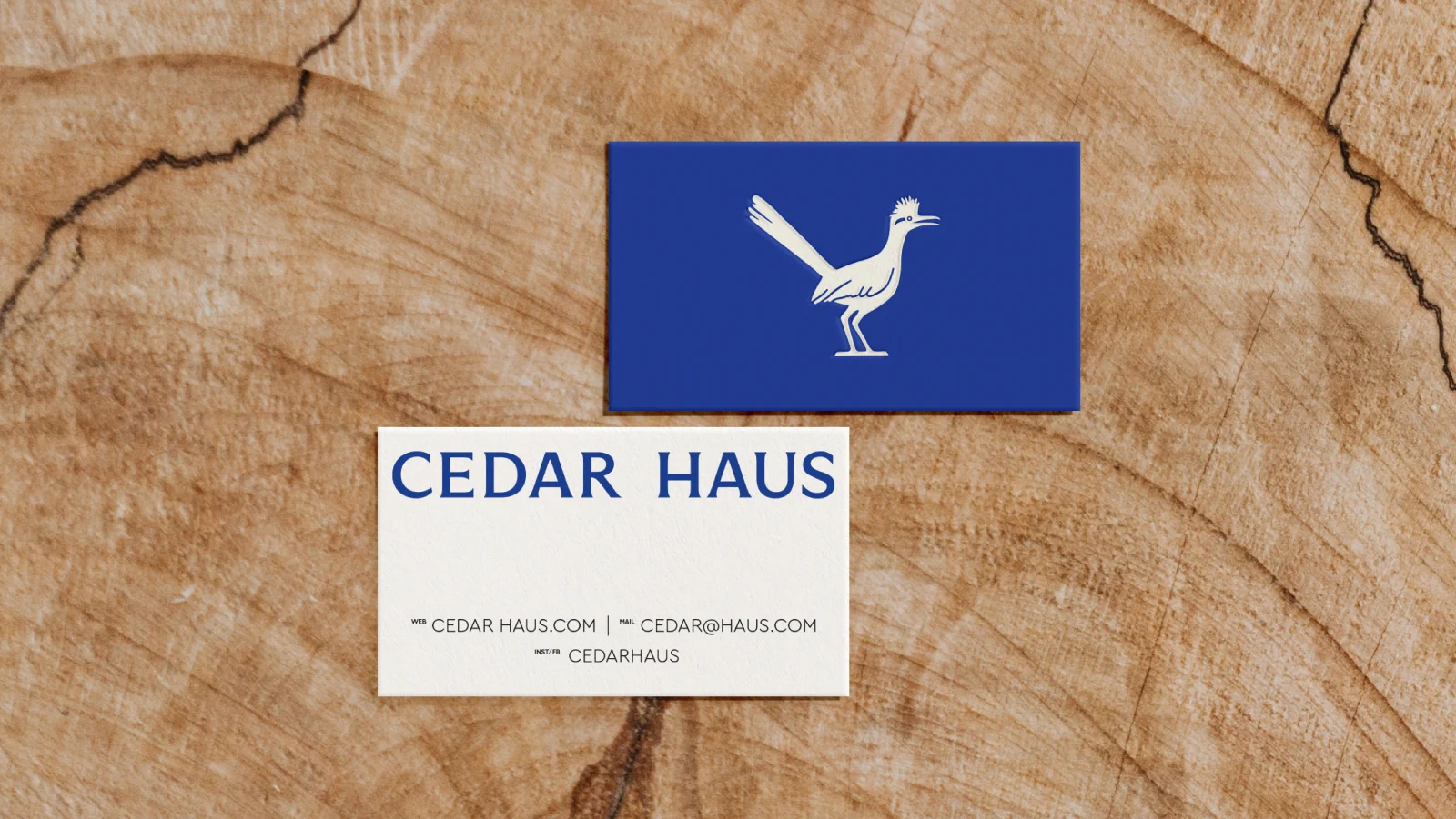
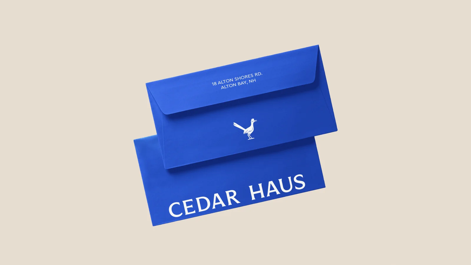
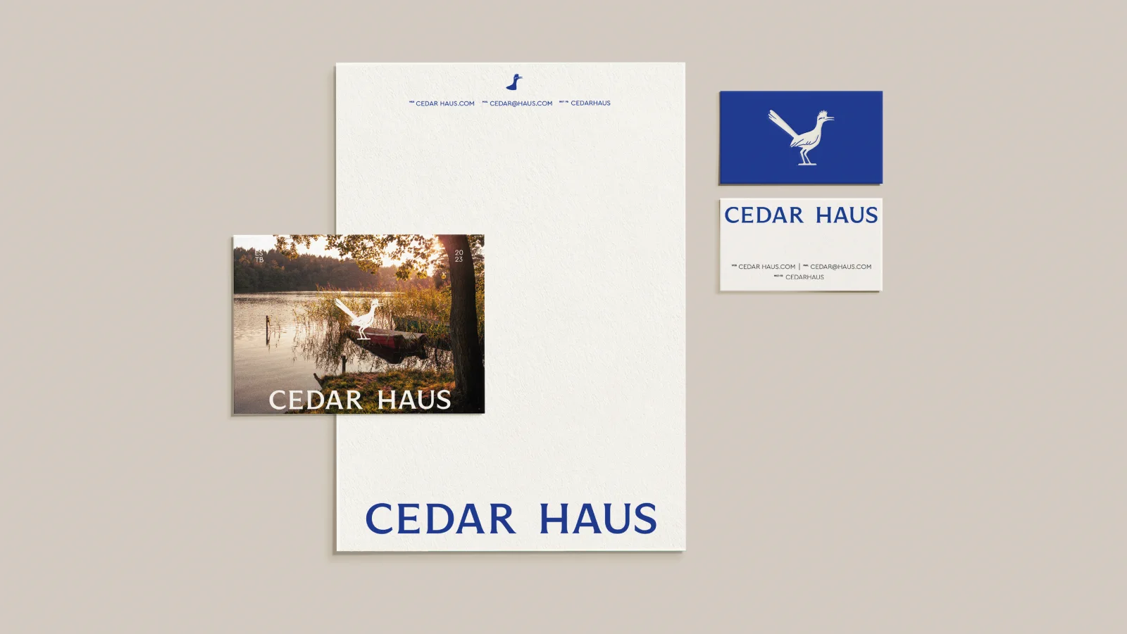
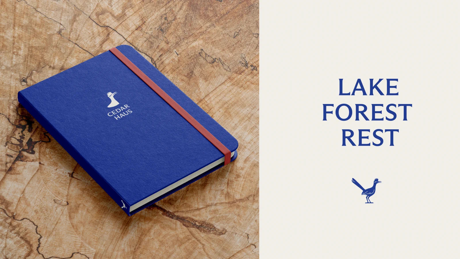
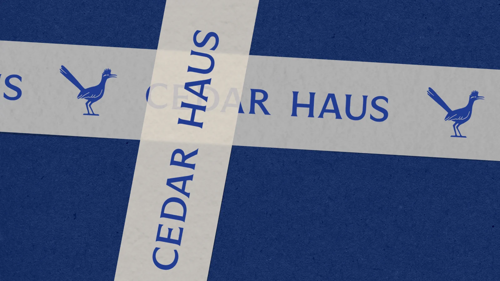
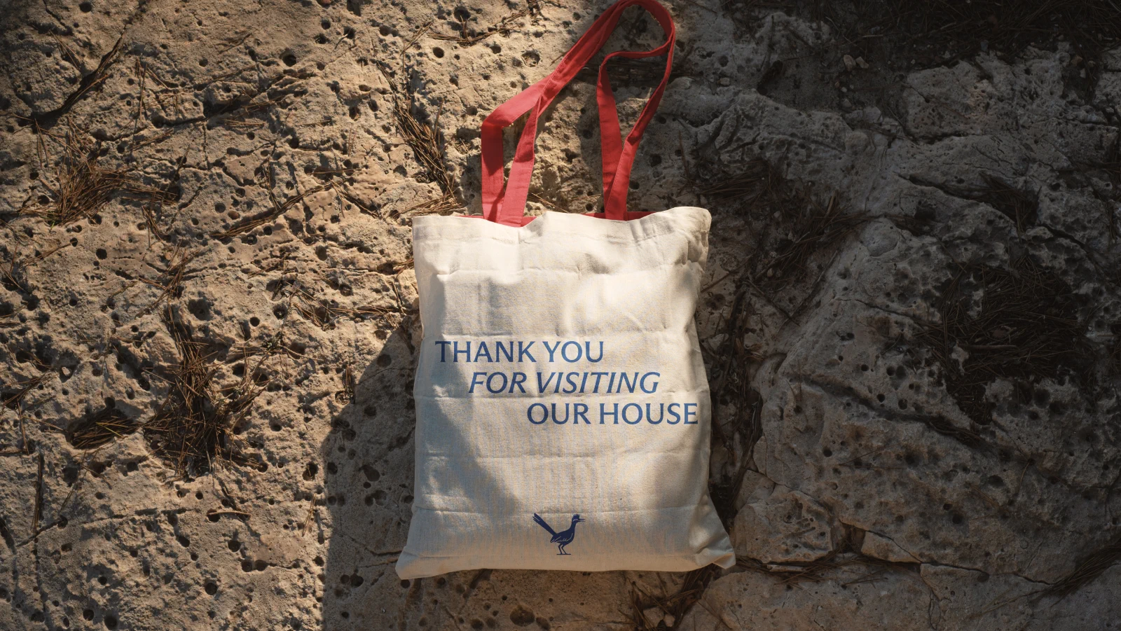
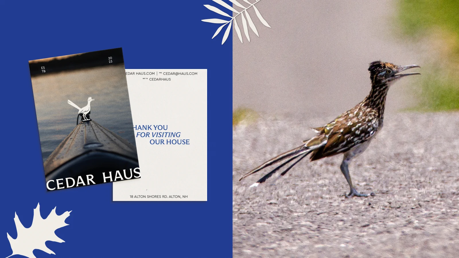
The brand mark is built around the roadrunner - a bird that embodies independence, speed, and resourcefulness. The illustration distills the bird’s distinctive silhouette into a clean, geometric form that works at any scale.
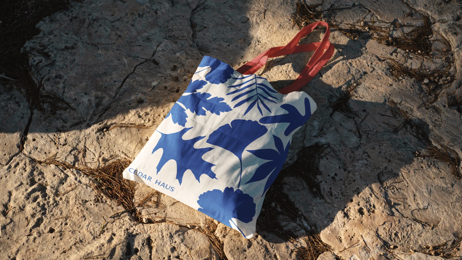
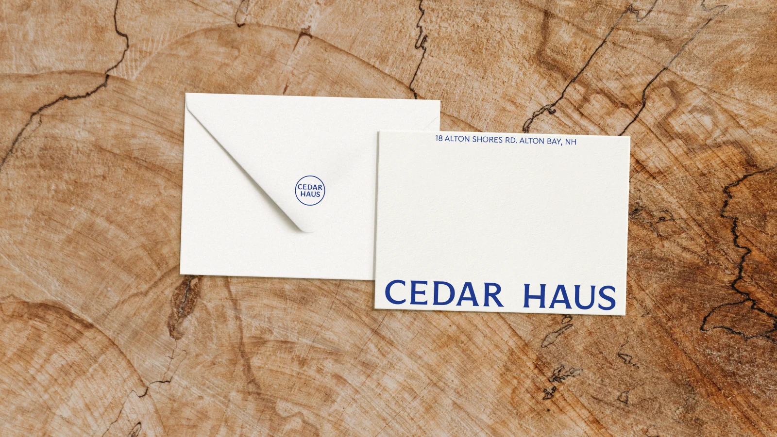
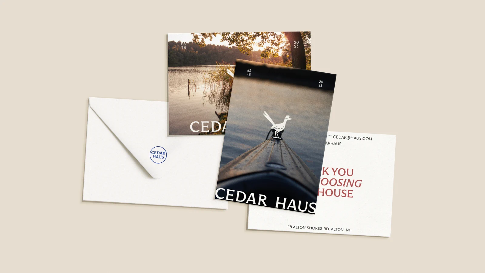
The color system pairs a bold cobalt blue with warm cream and natural stone tones - colors that photograph well in interior settings and feel at home alongside property listing imagery. Typography choices lean architectural: structured, confident, with enough warmth to avoid the corporate coldness the founders wanted to escape.
Visual System
Stationery & Brand Applications
Packaging & Merchandise
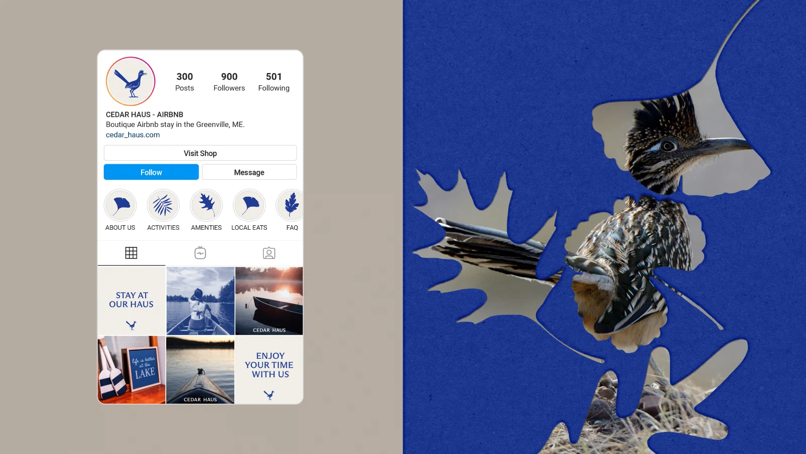
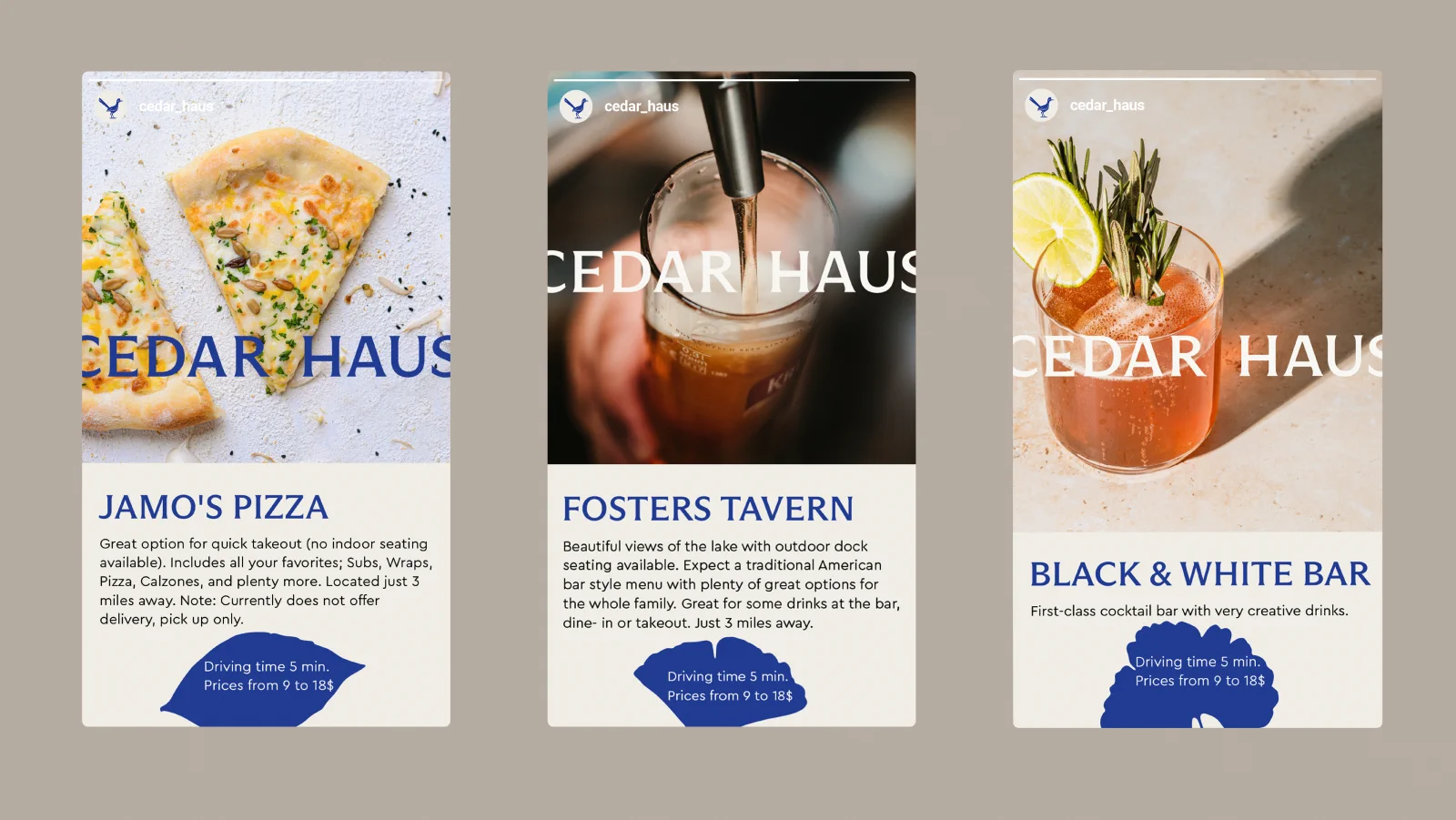
Digital & Social
Deliverables
- Logo & brand mark (roadrunner illustration)
- Color palette: cobalt blue, cream, warm stone
- Typography system
- Stationery set (business cards, letterhead, envelope, notecard)
- Branded notebook & welcome book
- Packing tape & tote bag
- Instagram profile & story templates
- Brand guidelines (PDF)
Result
4,103 appreciations · 22,424 views on Behance.
Looking for brand identity for a children’s fashion brand? See Minter and elebaby, or explore packages and pricing.
Like what you see?
Let's create something like this for your brand.
Next project
Minter - Children Knitwear Branding