Brand Identity
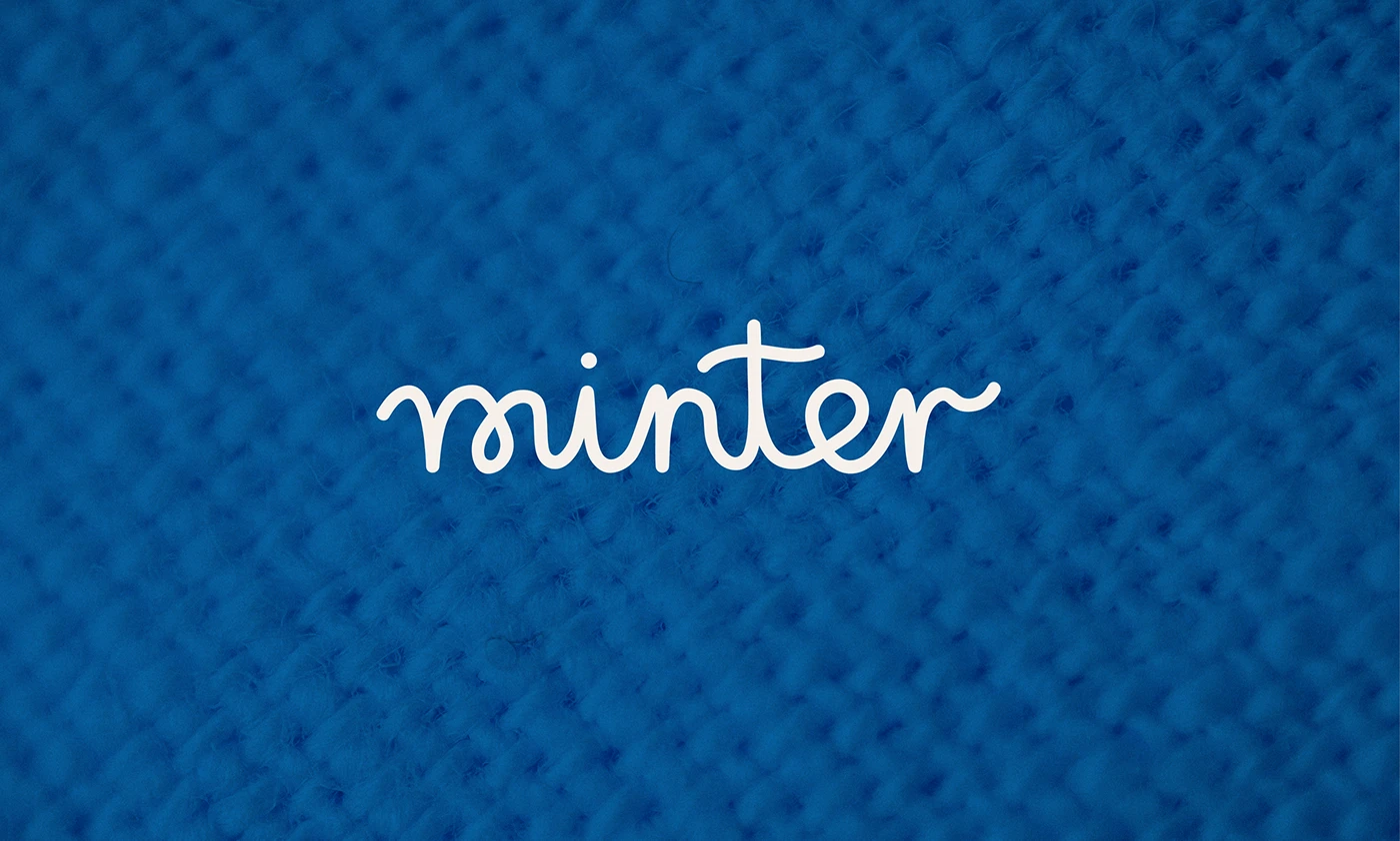
Minter — Children Knitwear Branding
Visual identity for a children's knitwear brand with an art-led philosophy. Bold color, clean geometric forms, tactile materials.
Client
Concept project
Year
2023
Services
The Brief
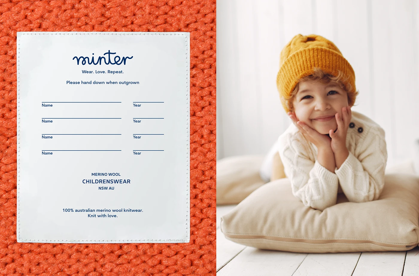
Minter is a childrenswear brand built around a single belief: children should grow up surrounded by good design.
The identity needed to embody that philosophy — visually sophisticated enough to appeal to design-conscious parents, bold enough to feel genuinely childlike.
The Approach
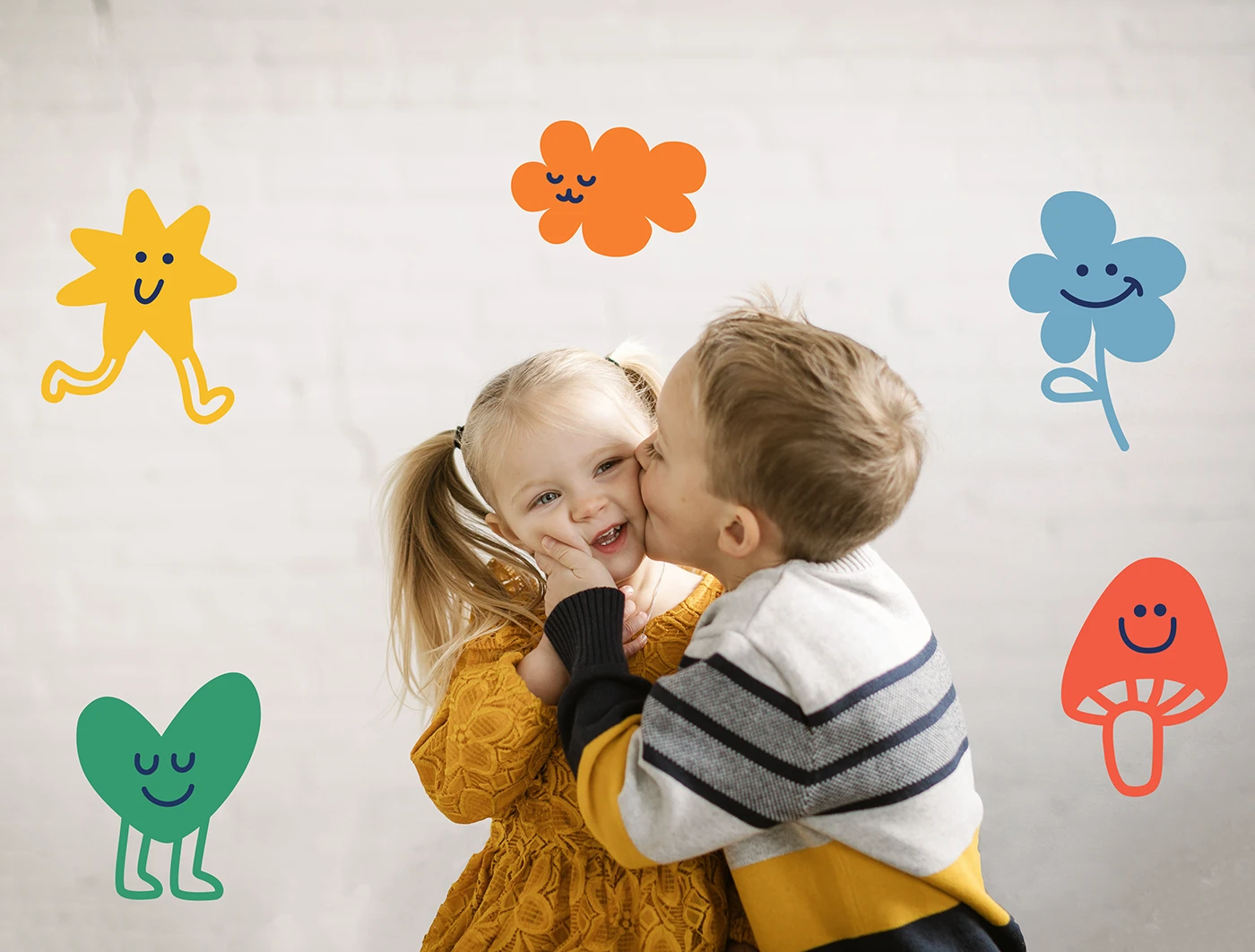
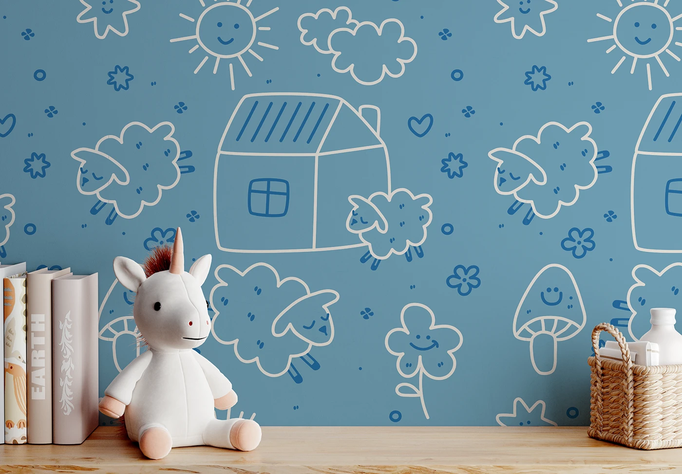
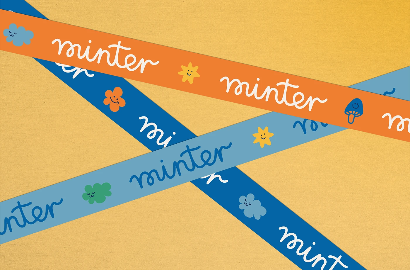
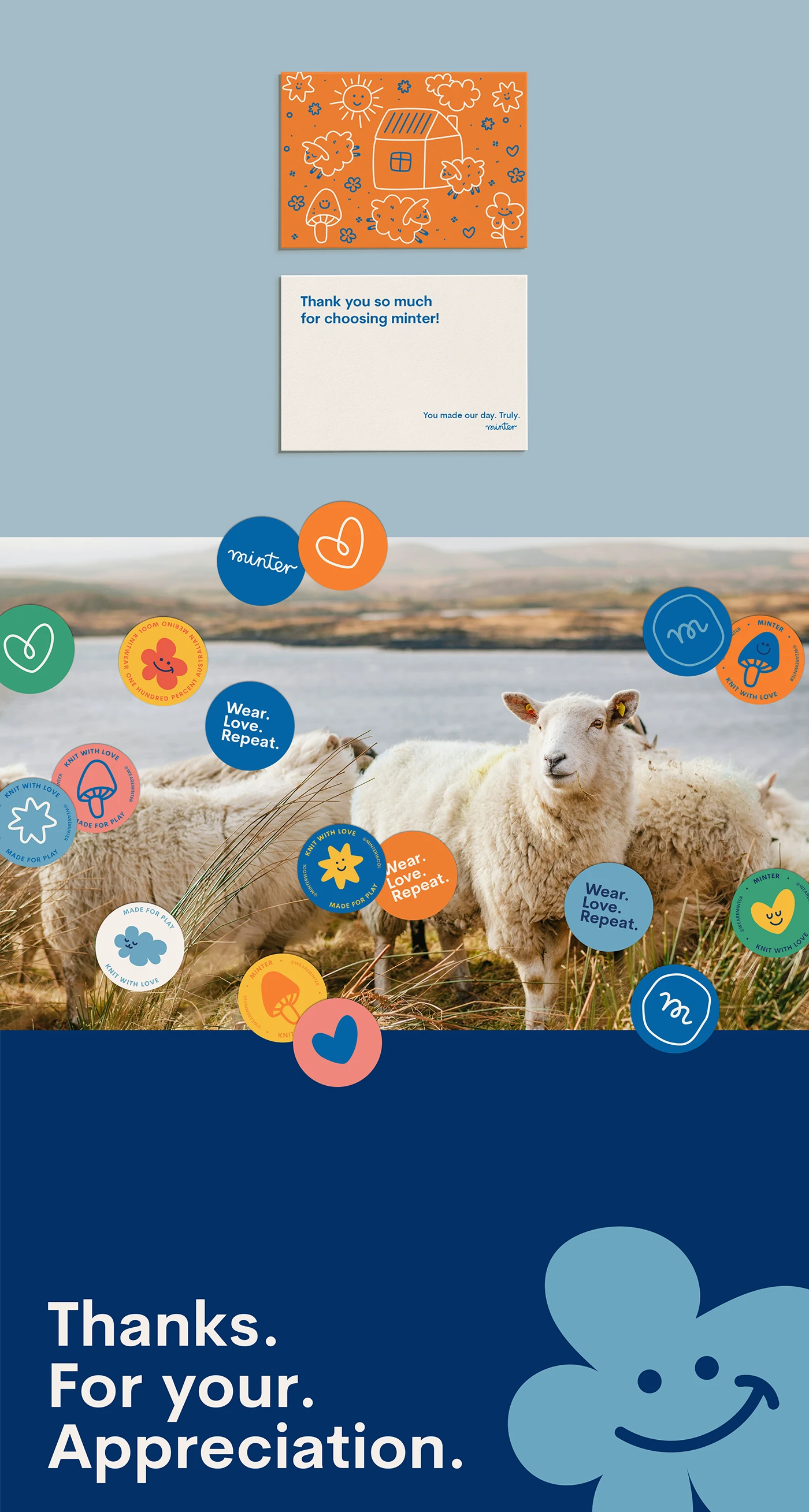
The brand borrows from the visual language of mid-century modern art: bold primary colors, geometric forms, generous whitespace. A modular pattern system was developed from simple geometric shapes — endlessly recombineable across different seasonal applications.
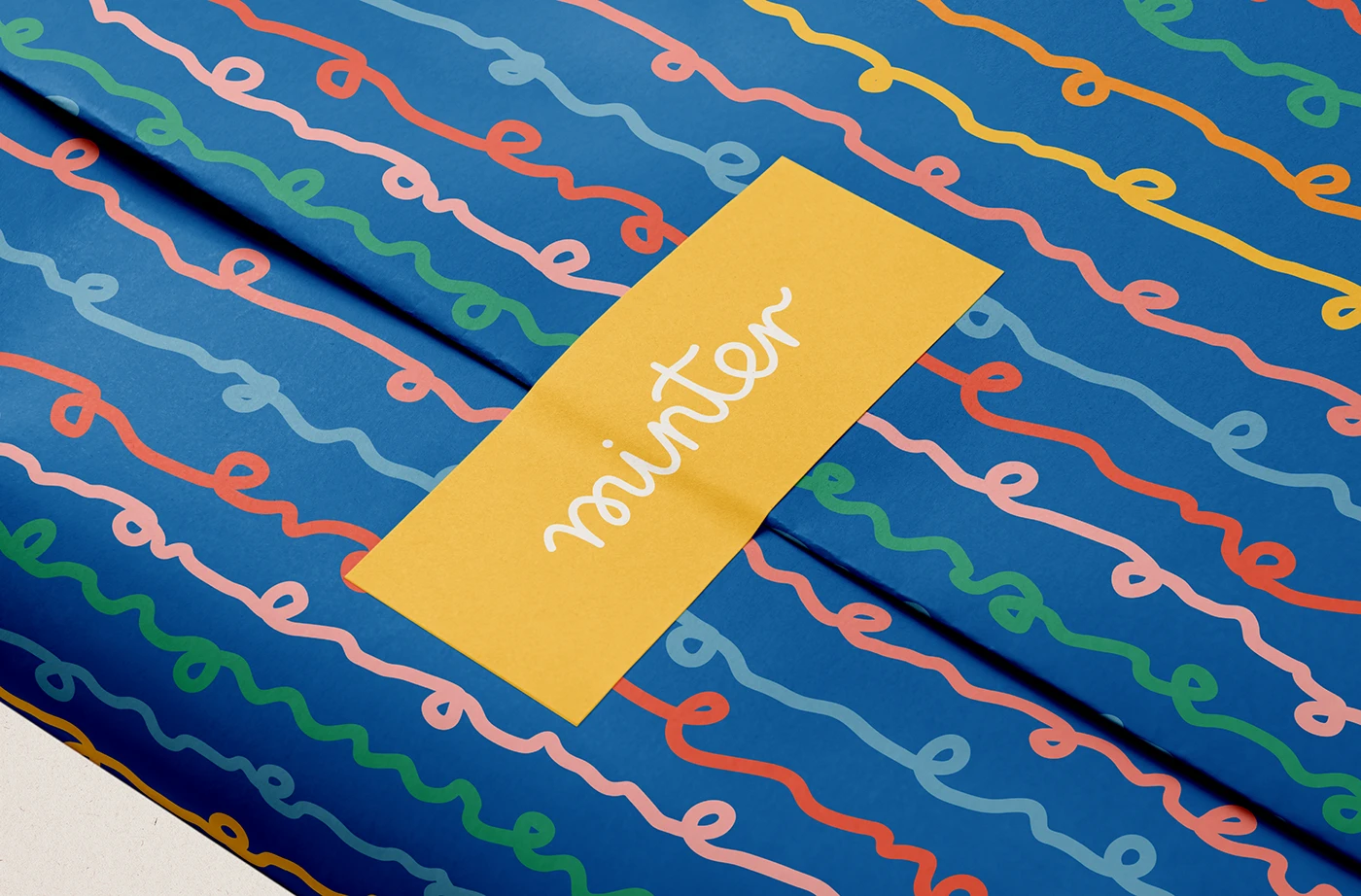
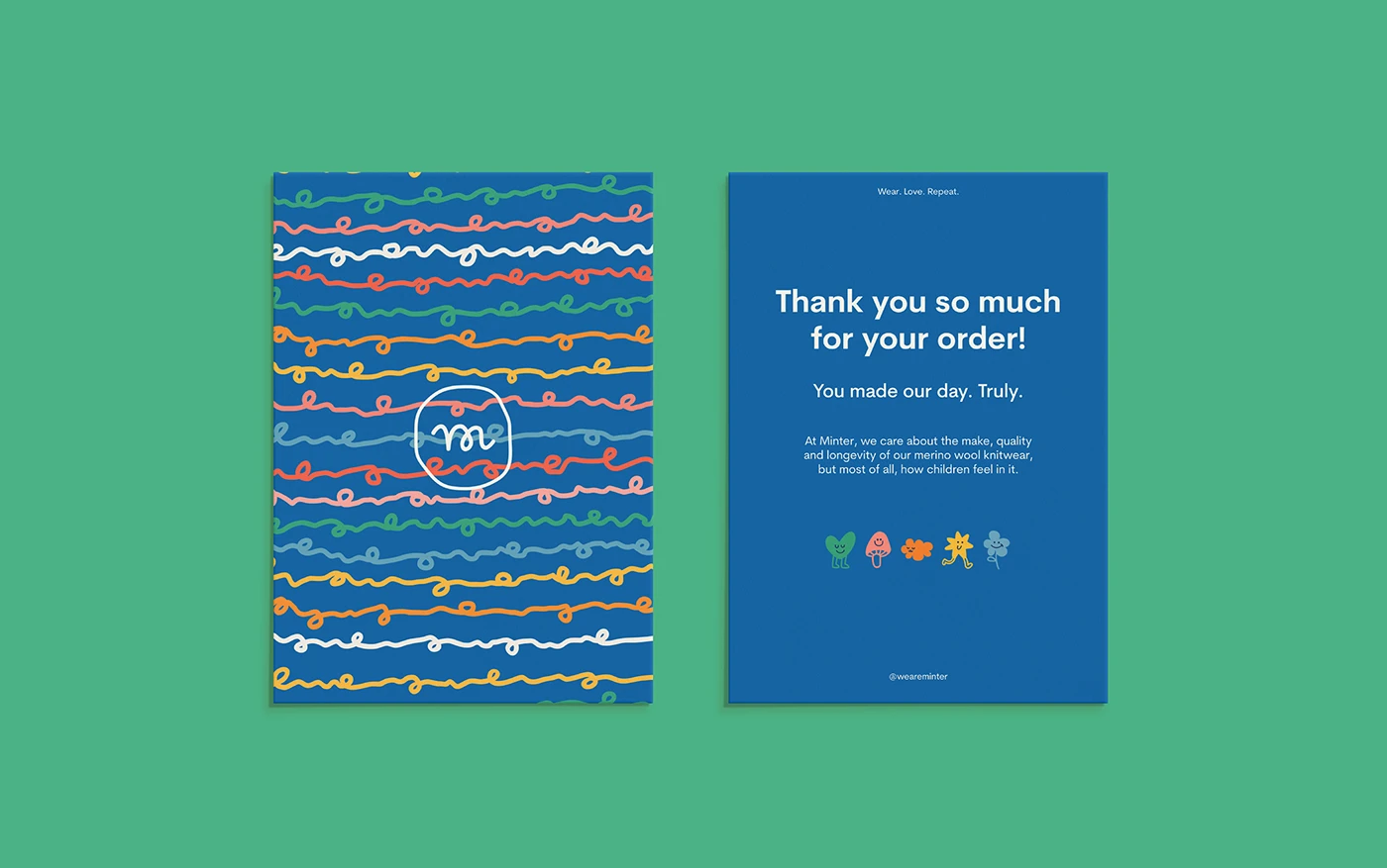
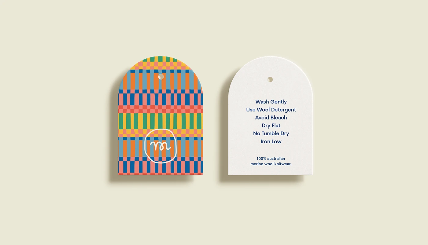
Pattern System
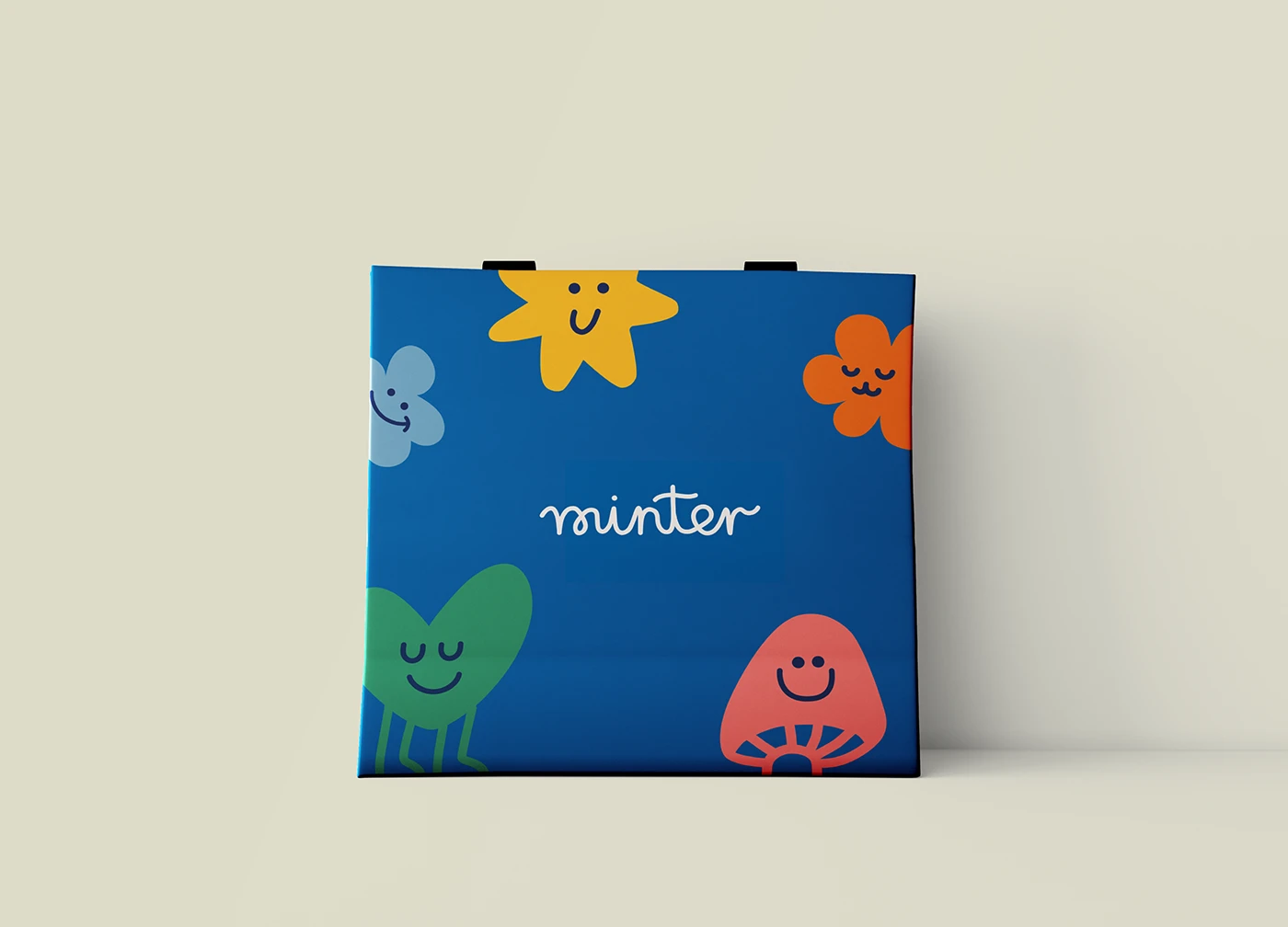
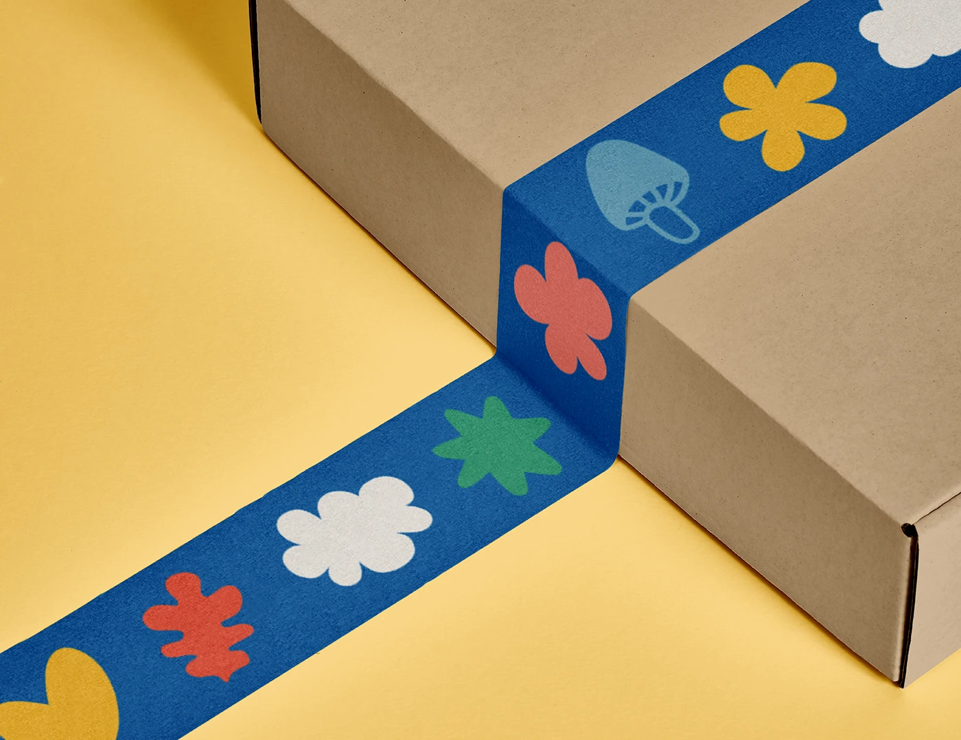
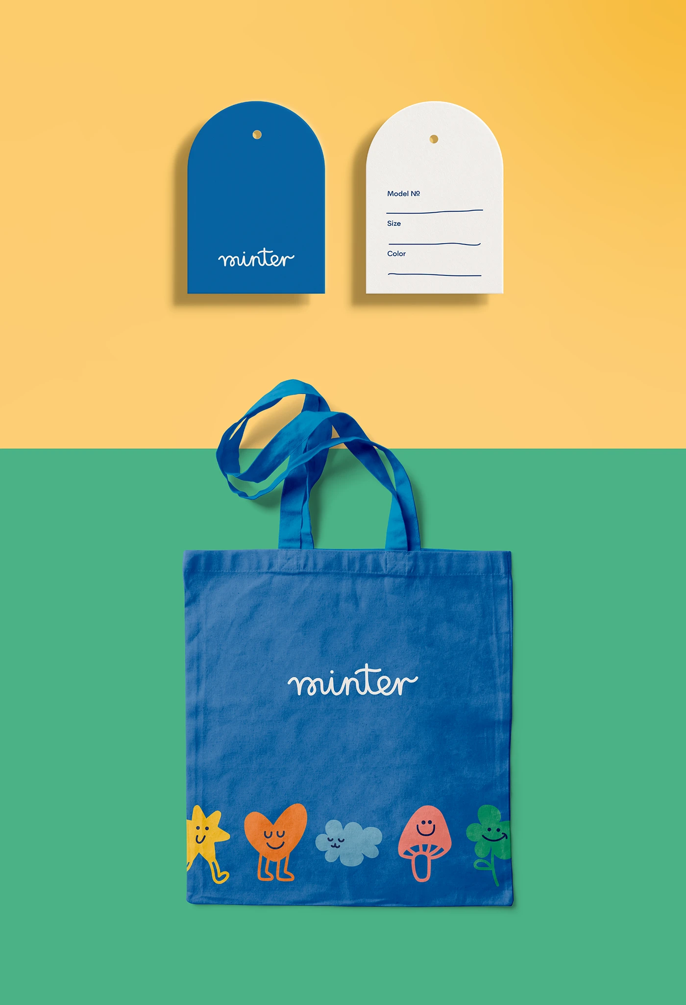
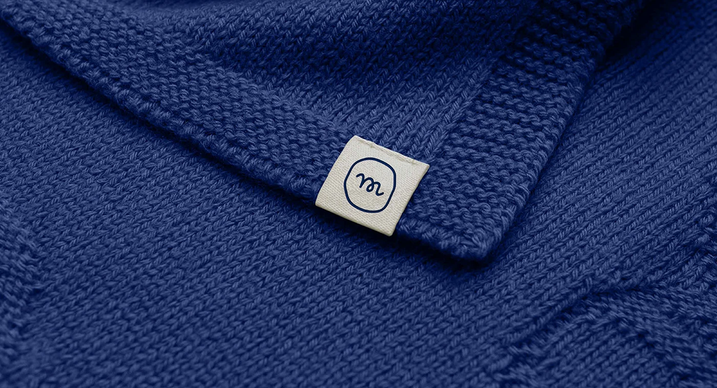
Packaging


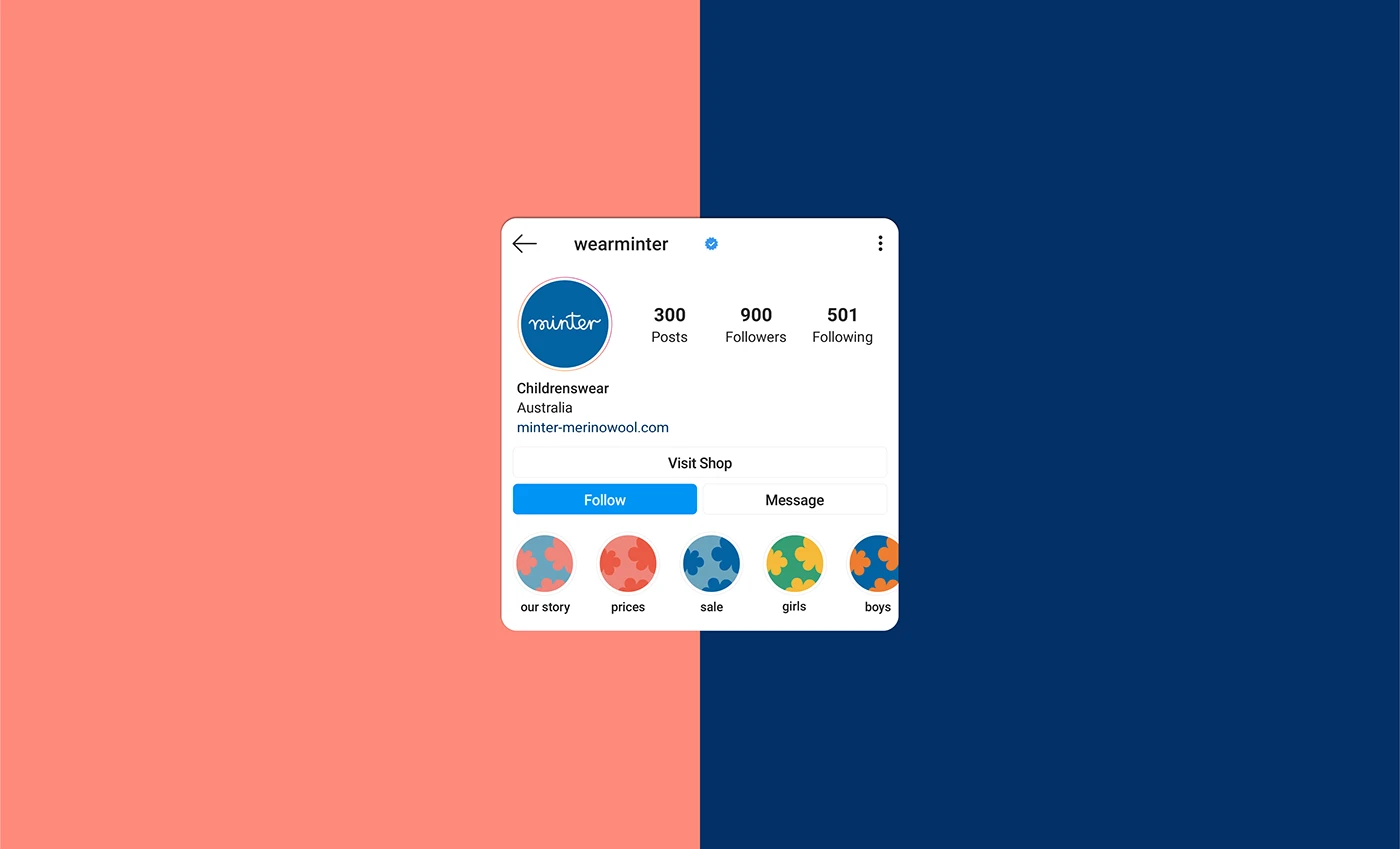
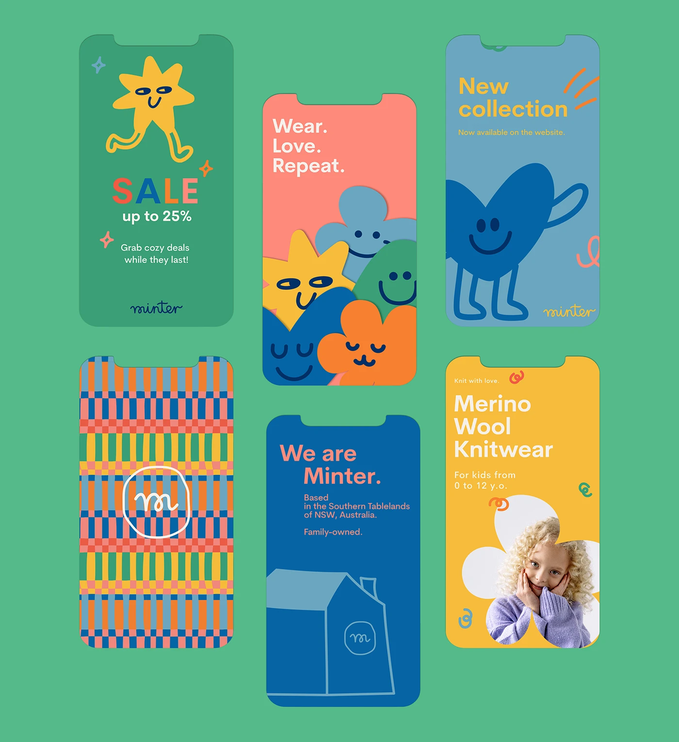
Brand Applications


Brand Guidelines
Deliverables
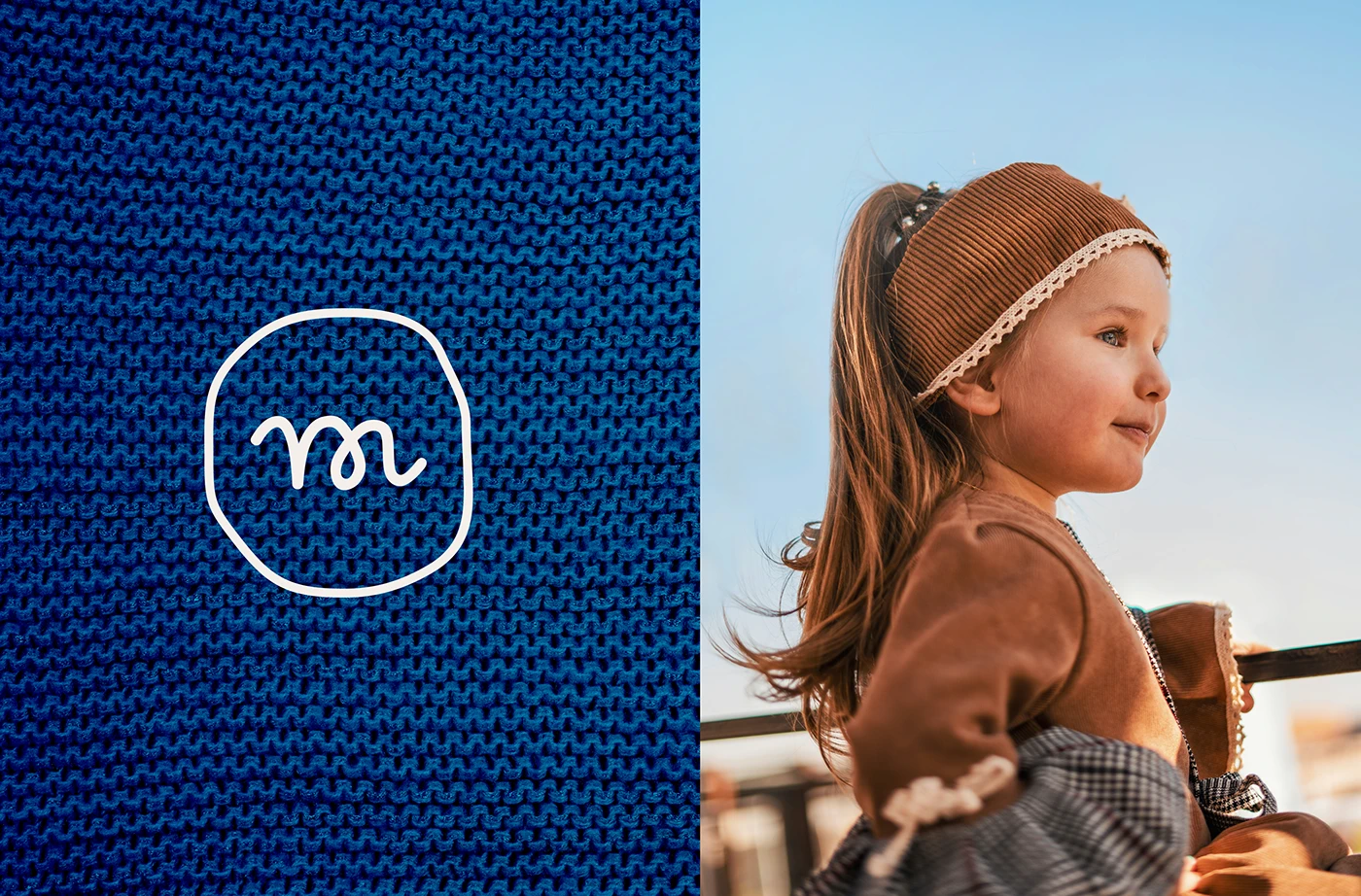
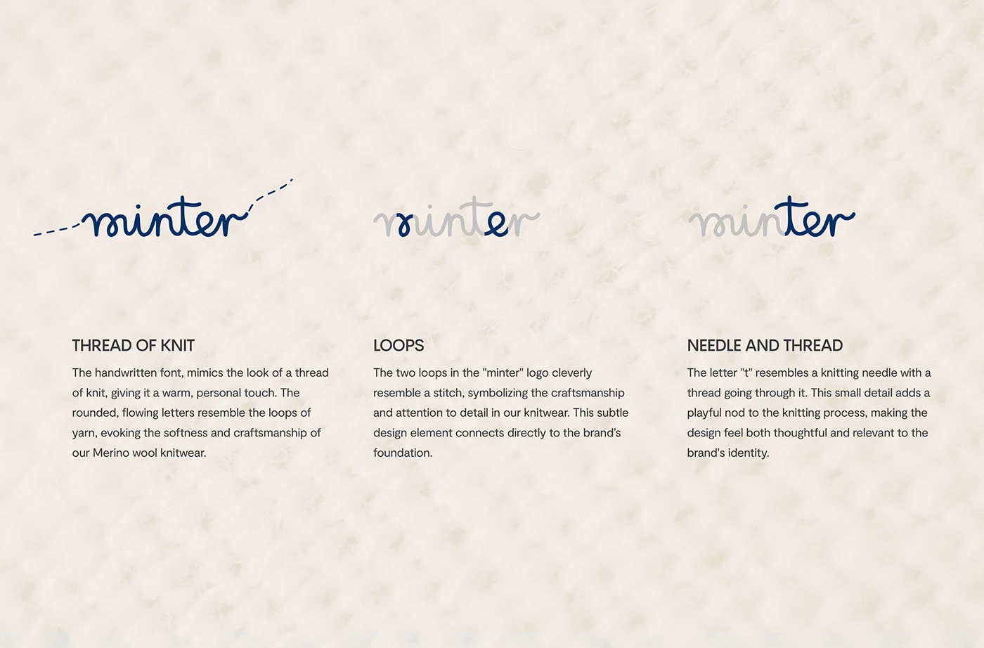
- Custom wordmark
- Geometric icon system
- Color palette (primary + seasonal extensions)
- Pattern & textile print design
- Lookbook layout
- Hang tag + label system
- Brand guidelines (PDF)
Result
2,160 appreciations · 16,920 views on Behance. Featured in the Behance Branding Gallery.
Like what you see?
Let's create something like this for your brand.
Next project
elebaby — Kids Wear Branding